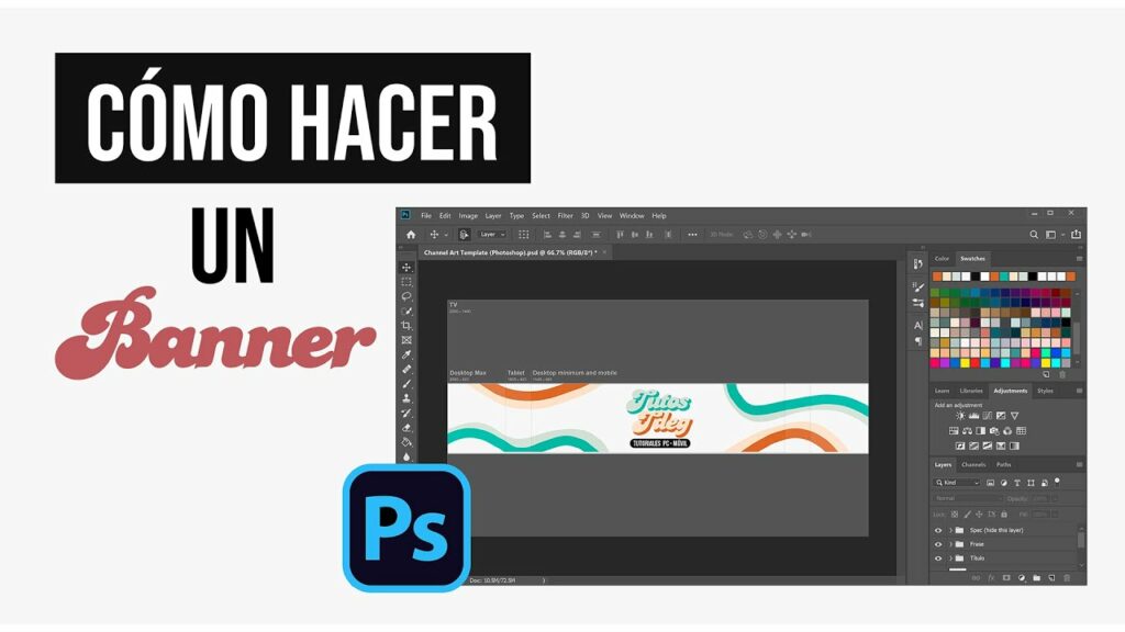
The Basics of Making a Banner in Photoshop
🎨
If you are looking to create eye-catching banners for your website or social media platforms, then Photoshop is the perfect tool for the job. With its powerful features and endless creative possibilities, you can design professional-looking banners that will leave a lasting impression on your audience. In this article, we will explore the basics of making a banner in Photoshop and guide you through the essential steps to get started.
One of the first things you need to consider when making a banner in Photoshop is the size and dimensions. Depending on where you plan to use the banner, whether it’s for a website header, social media cover, or advertisement, you will need to set the correct dimensions to ensure it fits perfectly. Make sure to check the specific requirements of the platform or website you will be uploading the banner to, as different platforms have different size recommendations.
Once you have determined the dimensions, it’s time to unleash your creativity and design your banner. Start by creating a new document in Photoshop and make sure to set the correct dimensions from the previous step. You can choose to start from scratch or use pre-made templates provided by Photoshop or third-party websites. Adding captivating visual elements, such as high-resolution images, bold typography, and vibrant colors, will help make your banner stand out and grab attention.
After you have designed your banner to your liking, it’s important to save it in the appropriate format. For web-based banners, it’s recommended to save them as JPEG or PNG files to ensure optimal quality and fast loading times. Be mindful of the file size, as larger files can take longer to load and may result in a poorer user experience. Additionally, consider optimizing your banner for SEO by providing relevant alt text and descriptive file names to improve its visibility in search engine results.
Step 1: Setting up Your Photoshop Canvas
🖌️
Setting up your Photoshop canvas is an essential step in any design process. It provides the foundation for your artwork and ensures that you have the correct dimensions and settings to work with.
To begin, open Photoshop and create a new document by going to File > New. This will bring up a dialog box where you can input the desired canvas size. Whether you are designing for web or print, it’s important to set the width, height, and resolution accordingly.
Once you have entered your canvas dimensions, you can also choose the color mode and background contents. RGB color mode is typically used for web design, while CMYK is preferred for print. Regarding the background, you can choose a transparent background or fill it with a solid color.
Additionally, Photoshop offers several presets that you can choose from if you’re not sure about the specific dimensions. These presets include various options for web design, print materials, and even social media graphics. Selecting a preset can save you time and ensure that your canvas is set up correctly.
In addition to the canvas size, you can also adjust the orientation (landscape or portrait) and the pixel aspect ratio if necessary. Once you’ve set up your canvas, you’re ready to start designing and bringing your ideas to life!
Step 2: Choosing the Right Colors and Background
🎨
Cuando se trata de diseñar un sitio web, elegir los colores y el fondo adecuados puede marcar una gran diferencia en la apariencia general y la experiencia del usuario. En esta segunda etapa, abordaremos la importancia de seleccionar los colores adecuados y cómo combinarlos inteligentemente para lograr un diseño atractivo y coherente.
A la hora de elegir los colores, es fundamental considerar el mensaje y la identidad de tu marca. Los colores transmiten emociones y crean una primera impresión en los visitantes de tu sitio. Por ejemplo, los tonos cálidos como los rojos y naranjas tienden a evocar energía y pasión, mientras que los tonos fríos como los azules o verdes pueden transmitir serenidad y calma. Es importante entender cómo tus colores elegidos representan los valores y personalidad de tu marca.
Además de la selección de colores, es esencial considerar la combinación adecuada. Evita usar demasiados colores diferentes, ya que esto puede ser abrumador para los usuarios. En cambio, opta por una paleta de colores que sea coherente y armoniosa. Una herramienta útil para esto es utilizar la rueda de colores, que te permite seleccionar colores complementarios o análogos que se vean bien juntos.
El fondo de tu sitio web también juega un papel crucial en el diseño. Debes asegurarte de que el fondo no distraiga ni dificulte la legibilidad del contenido. Un fondo demasiado oscuro puede hacer que el texto sea difícil de leer, mientras que un fondo demasiado brillante puede resultar molesto para los ojos. Es recomendable optar por colores suaves y neutros que proporcionen un contraste adecuado con el texto.
En resumen, seleccionar los colores y el fondo adecuados es un paso esencial para diseñar un sitio web atractivo y coherente. Recuerda que los colores transmiten emociones y reflejan la identidad de tu marca, así que elige sabiamente. Combina inteligentemente los colores para lograr una paleta armoniosa y ten en cuenta que el fondo debe ser legible y complementar el contenido. ¡Sigue esta segunda etapa y estarás un paso más cerca de tener un sitio web visualmente atractivo y eficaz!
- 📱👨⚕️ Descubre cómo optimizar tu experiencia de atención médica con el Banner Patient Portal
- 🎨 ¡Descubre el impresionante mundo del 🌸 Banner Fu Xuan! ¡Inspírate con diseños increíbles y colores vibrantes! 🖼️💫
- 🎉 ¡Revive la nostalgia con el mejor 🔥 banner de los 80! Descubre los diseños más icónicos y tendencias de la época
- 🎉🌍 ¡Descubre los mejores ✈️ banners para tus viajes! Atrae miradas y planifica tus aventuras con estilo 🌟
- 🎯 ¡Descubre el poder del sensor manual Banner Q4X en español! 🌐
Step 3: Adding Text and Typography
😄
En el tercer paso de nuestro proceso de creación de sitios web, vamos a abordar la adición de texto y tipografías en nuestro proyecto. El uso adecuado de las fuentes y la presentación del texto son elementos clave para asegurar una experiencia de lectura agradable y una comunicación efectiva.
Para empezar, es fundamental seleccionar las fuentes adecuadas que se ajusten al tema y estilo del sitio web. Es importante recordar que las fuentes deben ser legibles, tanto en tamaño como en estilo. Si bien es tentador utilizar fuentes llamativas, es esencial que los visitantes puedan leer fácilmente el contenido.
Una vez que hayamos seleccionado nuestras fuentes, debemos considerar aspectos como el tamaño del texto y el espaciado. El tamaño del texto debe ser lo suficientemente grande como para ser legible en diferentes dispositivos, y el espaciado entre líneas debe ser adecuado para evitar que el texto se vea demasiado apretado.
La división adecuada del texto también es crucial para una experiencia de lectura fluida. Utilizar encabezados H3 puede ser una excelente manera de estructurar y organizar nuestro contenido. Los encabezados ayudan a los lectores a navegar por el contenido y captar de inmediato la información clave.
Además de la estructuración, podemos aprovechar las listas en HTML para presentar la información de manera ordenada. Las listas numeradas o con viñetas permiten una lectura más clara y eficiente, especialmente en casos en que hay una gran cantidad de información que presentar.
En resumen, añadir texto y tipografías apropiadas en nuestro sitio web es esencial para lograr una comunicación efectiva y una experiencia de lectura agradable. Elije fuentes legibles y ajusta el tamaño y el espaciado del texto para obtener resultados óptimos. Utiliza encabezados H3 y listas en HTML para organizar la información y facilitar la lectura. ¡Con estos pasos, estarás en buen camino para desarrollar un sitio web que sea atractivo y fácil de leer!
Step 4: Incorporating Images and Graphics
📸 Step 4: Incorporating Images and Graphics 🌈
When it comes to creating captivating content, images and graphics play a crucial role. Including visual elements in your website or blog not only makes the page aesthetically pleasing but also enhances the user experience. In this step, we will explore the importance of incorporating images and graphics and how they can take your content to the next level.
Using relevant images and graphics helps to convey your message effectively. People tend to be more engaged with visually appealing content, so make sure to choose images that complement your text and convey the desired message. Whether it’s a photograph, infographic, or an illustration, including visuals can make your content more memorable and shareable.
Adding alt text to your images and graphics is essential for SEO. Alt text provides a description of the visual to search engines, making it easier for them to understand what the image is about. It also helps visually impaired users who rely on screen readers to understand the content better. Make sure to use descriptive alt text that accurately defines the image and includes relevant keywords.
Optimizing the size of your images is another important aspect to consider. Large image files can slow down your website, affecting its loading speed and user experience. Compressing your images without compromising their quality can help improve the performance of your website. You can use various online tools or plugins to optimize and compress your images before uploading them to your site.
Another useful technique is implementing responsive images. With the increasing number of mobile users, it’s crucial to ensure your images and graphics adapt to different screen sizes. Using CSS media queries, you can set different image sizes for different devices, ensuring your visuals look great, regardless of the device your audience is using.
Incorporating a visually appealing call to action (CTA) within your images or graphics can improve user engagement. CTAs prompt visitors to take action, whether it’s subscribing to a newsletter, making a purchase, or sharing your content. By strategically placing CTAs within your visuals, you can encourage users to interact with your content and increase conversions.
To wrap it up, incorporating images and graphics can significantly enhance the overall look and feel of your website or blog. By choosing relevant visuals, optimizing their size, and adding alt text, you can improve your SEO efforts and provide a better user experience. So, unleash your creativity, and let images and graphics take your content to new heights! 🎨💻
Step 5: Finalizing and Exporting Your Banner
🎉
En el paso 5, nos encontramos en la fase final del proceso de creación de nuestro banner. Después de haber diseñado y ajustado todos los elementos gráficos y textuales, es hora de poner los toques finales y exportar nuestro banner para su uso.
📐
Para comenzar, es importante revisar y asegurarnos de que todos los elementos estén en su lugar correcto. Verifica que los textos estén correctamente alineados, las imágenes se ajusten según lo planeado y los colores y fuentes sean consistentes en todo el banner.
💾
Una vez que estemos satisfechos con el diseño, es hora de exportar nuestro banner en el formato adecuado. Esto dependerá de cómo y dónde planeamos usar nuestro banner. Algunas opciones comunes de formato de archivo son JPEG, PNG o GIF, entre otros.
✅
Antes de finalizar, asegúrate de elegir la resolución y tamaño adecuados para tu banner. Esto puede variar según el medio en el que se mostrará y las especificaciones requeridas. Recuerda que un banner demasiado grande puede afectar la carga de la página y la experiencia del usuario.
En resumen, el paso 5 de nuestro proceso de creación de banners se centra en finalizar y exportar nuestro diseño. Asegúrate de revisar y ajustar todos los elementos, elige el formato de archivo adecuado y el tamaño correcto para garantizar un resultado de alta calidad. ¡Estamos a punto de tener un banner listo para brillar y captar la atención de nuestro público objetivo!
 🎨💻 Cómo hacer un banner en Word: ¡Guía paso a paso para crear diseños impactantes!
 🎨✨ Tutorial Photoshop Banner: Crea diseños llamativos y profesionales paso a paso
 🎨 Cómo hacer un banner en PowerPoint: ¡Deja volar tu creatividad!
 ✨ Crea tu banner gratis: Descubre las mejores herramientas y consejos para diseñar tu propio banner 🎨
 🎨 Cómo crear un 🖼️ espectacular con Pixlr Banner: Guía paso a paso
 🎨💻 Guía completa: ✂️✍️ Cómo hacer un banner para tu página web paso a paso
 🎨🖌️ Descubre la magia del diseño de banners: tips y trucos para resaltar con tu creatividad
 🎉 ¡Descubre todo lo que necesitas saber sobre el increíble mundo del 🎨 Banner Kit 🚀!
 🎨 ¡Diseña tus banners de forma rápida y sencilla con esta plantilla! 🖌️