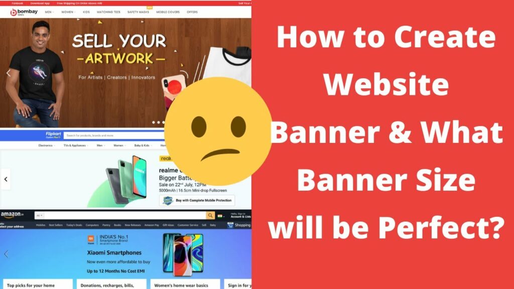
1. Understanding the Importance of Website Banner Size
📢
Website banner size plays a crucial role in the overall success of a website. It may seem like a minor detail, but it has a significant impact on user experience and website performance. In this blog post, we will dive deep into the importance of website banner size and why it should not be overlooked.
🎯
One of the main reasons why website banner size is vital is because it determines the first impression visitors have of your website. A banner that is too small or too large can instantly turn off users and make them leave your site. On the other hand, a well-designed and appropriately sized banner can captivate users and engage them.
🔍
Another aspect to consider is the visibility of your banner. A small banner may not be easily noticeable, leading to missed opportunities for showcasing your brand or promoting your products. Conversely, an excessively large banner can overshadow other critical elements on your website, such as the navigation menu or important content.
💻
Moreover, the size of your website banner can affect the loading speed of your website. A banner that is too heavy in terms of file size can take longer to load, causing frustration and impatience among users. To ensure a smooth and seamless browsing experience, it is crucial to optimize your banner size while maintaining its quality.
🌈
Furthermore, website banner size also comes into play when it comes to responsive design. With the prevalence of mobile devices, having a responsive banner that adapts well to different screen sizes is essential. A banner that is too large on a small mobile screen can disrupt the overall layout and make it difficult for users to navigate your site.
📐
In conclusion, understanding the importance of website banner size is vital for creating a visually appealing and user-friendly website. From making a good first impression to optimizing loading speed and ensuring responsiveness, the right banner size can make all the difference. Take the time to choose the appropriate dimensions and optimize your banner for the best results.
2. Ideal Website Banner Dimensions for Desktop
The banner on your website plays a crucial role in capturing the attention of visitors. It serves as the first impression and sets the tone for the overall user experience. Therefore, it is important to choose the ideal dimensions for your website banner, especially for desktop users.
When it comes to desktop browsing, you have more screen real estate to work with compared to mobile devices. This allows for a larger and more impactful banner. The ideal dimensions for a website banner on desktop are typically around 1920 pixels wide and 600 pixels tall.
By adhering to these dimensions, you ensure that your banner will display properly on most desktop screens without any distortion or loss of visual quality. It is important to note that the actual dimensions may vary depending on the design and layout of your website, so it is best to consult with a professional web designer to determine the exact measurements for your specific needs.
A well-designed and appropriately sized website banner can significantly enhance the visual appeal of your website and make a lasting impression on your visitors. It is an opportunity to showcase your brand, products, or services while also conveying your unique message. Utilize bold and captivating visuals, along with compelling text, to create a banner that instantly communicates your website’s purpose and engages your audience.
In conclusion, when it comes to creating an ideal website banner for desktop users, it is crucial to consider the dimensions to ensure it fits the screen perfectly. Aim for dimensions around 1920 pixels wide and 600 pixels tall, although it’s always best to consult with a web designer for precise measurements. By investing time and effort into designing a visually appealing and engaging banner, you can effectively capture the attention of your audience and provide a positive user experience on your website.
3. Best Practices for Website Banner Size on Mobile Devices
❗️😎 Best Practices for Website Banner Size on Mobile Devices 😎❗️
When it comes to designing a website, the banner plays a crucial role in capturing users’ attention. This is especially true for mobile devices, where space is limited, and every pixel counts. In this article, we will discuss the best practices for determining the optimal banner size for mobile devices.
📏 Size matters! The first step is to consider the dimensions of the mobile device screen. It’s essential to choose a banner size that fits well and doesn’t overpower the rest of the content. Experts recommend keeping the banner width between 320 and 375 pixels, which ensures that it scales properly on different devices and doesn’t appear disproportionate.
👁️🗨️ Visibility is key! Remember that users have limited screen space on their mobile devices, so it’s crucial to make your banner visible without being intrusive. Placing the banner at the top of the page guarantees that users will see it immediately upon loading. Additionally, avoid excessive use of text or crowded images in the banner, as it can distract from the main content.
🖼️ Quality matters too! While choosing the right size is important, ensuring that the banner is of high quality is equally crucial. Pay attention to the resolution and file size of your banner image. Compress the image to reduce the file size without sacrificing too much quality. This way, you can maintain a fast-loading website without compromising the visual appeal of your banner.
💡 Test and optimize! The key to finding the perfect banner size for your website is through testing and optimization. Use analytics tools to track user behavior and engagement with your banners. Experiment with different sizes and designs to see which one performs best in terms of click-through rates and conversions. Continuous monitoring and refinement will help you create an effective and visually appealing banner for mobile devices.
By following these best practices, you can ensure that your website’s banner stands out on mobile devices without dominating the screen or compromising usability. Remember, the goal is to capture users’ attention and provide a seamless browsing experience, making them more likely to stay on your website and engage with your content. So, go ahead and optimize your website banner for mobile devices using these tips!
- 📱👨⚕️ Descubre cómo optimizar tu experiencia de atención médica con el Banner Patient Portal
- 🎨 ¡Descubre el impresionante mundo del 🌸 Banner Fu Xuan! ¡Inspírate con diseños increíbles y colores vibrantes! 🖼️💫
- 🎉 ¡Revive la nostalgia con el mejor 🔥 banner de los 80! Descubre los diseños más icónicos y tendencias de la época
- 🎉🌍 ¡Descubre los mejores ✈️ banners para tus viajes! Atrae miradas y planifica tus aventuras con estilo 🌟
- 🎯 ¡Descubre el poder del sensor manual Banner Q4X en español! 🌐
4. Common Mistakes to Avoid When Choosing Website Banner Size
😎
When it comes to designing a website, choosing the right banner size is crucial for user experience. However, many website owners make common mistakes that can hinder their site’s effectiveness. In this article, we will explore the most frequent mistakes to avoid when selecting a website banner size.
One common mistake is using a banner size that is too large, resulting in slow loading times. Slow-loading banners not only frustrate visitors but also affect your site’s bounce rate. It is essential to strike a balance between an eye-catching banner and fast-loading speed to ensure a seamless browsing experience.
Another mistake to avoid is using a banner size that does not fit well with your website’s layout. A banner that is too small may go unnoticed, while an oversized banner can overwhelm the page, making it difficult for users to navigate. It is important to choose a size that complements the overall design and layout of your website.
Moreover, failing to consider responsive design is a significant error. With the increasing use of mobile devices, it is crucial to select a banner size that adapts well to different screen sizes. A responsive banner will ensure that your website remains visually appealing and functional across all devices, enhancing user experience and engagement.
Additionally, neglecting the alignment of your banner with the rest of the page content can be detrimental. A banner that is not aligned properly with the surrounding elements can create a disjointed look and confuse visitors. Ensuring that the banner integrates seamlessly with the rest of the page is essential for maintaining a cohesive design.
Lastly, overlooking the importance of testing different banner sizes can lead to missed opportunities. A/B testing different banner sizes will provide valuable insights into which size performs best in terms of engagement and conversion rates. By testing and analyzing the results, you can optimize your website’s banner size for maximum effectiveness.
In conclusion, choosing the right website banner size is crucial for a successful online presence. By avoiding common mistakes like using banners that are too large, not considering responsiveness, neglecting alignment, and failing to test different sizes, you can ensure that your website’s banner captivates visitors and enhances their browsing experience.
5. Tools and Resources for Determining the Right Website Banner Size
🛠️ In the competitive world of online marketing, having the right website banner size can make all the difference in capturing your audience’s attention. A poorly sized banner may go unnoticed or even detract from your overall design. Thankfully, there are numerous tools and resources available to help you determine the perfect banner size for your website.
📏 One popular tool is the «Banner Ad Sizes» website, which provides a comprehensive list of standard banner sizes according to industry standards. This resource is particularly useful if you’re new to banner design or unsure about the dimensions that work best for different platforms or ad placements. It provides a clear breakdown of the various banner sizes and their recommended uses.
🖥️ Another valuable resource to consider is Google’s Display & Video 360 platform. This powerful tool not only allows you to create and manage banner ads but also provides valuable insights and recommendations on sizing. By utilizing the audience insights and targeting capabilities offered by this platform, you can ensure that your banner ads are delivered to the right viewers on the right devices.
📊 If you’re looking for more data-driven approaches, there are also specialized tools like Bannersnack and AdEspresso. These platforms allow you to test multiple banner sizes, designs, and placements through A/B testing. By analyzing the performance of different banner sizes, you can optimize your ad campaigns and maximize your return on investment.
🔍 Additionally, many graphic design programs, such as Adobe Photoshop and Canva, offer pre-designed banner templates with recommended sizes. These templates can serve as a starting point for your banner design, ensuring that you’re working within industry-standard dimensions. Customizing the templates to fit your branding and messaging is easy and can save you valuable time and effort.
💬 Lastly, it’s always beneficial to stay updated with industry trends and best practices. Online forums and communities, such as Reddit and Quora, can provide valuable insights from experienced designers and marketers. Engaging in discussions and asking for advice can help you stay ahead, ensuring that your website banners are at the forefront of design and optimization.
✅ In summary, determining the right website banner size requires careful consideration and research. By utilizing the tools and resources mentioned above, you can ensure that your banners are visually appealing, optimized for different platforms, and effectively capture your audience’s attention. Don’t underestimate the impact that the right banner size can have on your website’s success in attracting and engaging visitors.
6. Impact of Website Banner Size on Page Load Speed
🖥️
Website performance is a crucial factor in today’s digital world. Users expect websites to load quickly and smoothly, and any delay can lead to frustration and abandonment. One significant element that can impact the page load speed is the size of the website banner.
📏
The website banner, also known as the hero image or header image, is the large image or visual element at the top of a webpage. It serves as a visual representation of the brand or the website’s main message. However, if the banner size is too large, it can significantly slow down the page load speed.
💨
A larger banner size means a larger file size, which takes more time to download and display on the user’s browser. When a webpage has multiple images, videos, and other content, a large banner can become a bottleneck, affecting the overall loading speed of the page. Therefore, it’s crucial to optimize the website banner size to ensure a fast and smooth user experience.
🖼️
One way to optimize the website banner size is by compressing the image file. By reducing the file size without compromising the image quality, you can help improve the page load speed significantly. There are various image compression tools and techniques available that can be used to achieve this. Typically, compressing the image by removing unnecessary metadata and reducing resolution can have a significant impact on file size reduction.
⌨️
Another approach to consider is implementing lazy loading techniques for website banners. Lazy loading is a method where the website only loads images as they become visible on the user’s screen. This approach helps reduce the initial load time of the page, as the banner image is loaded only when the user scrolls to that section. By implementing lazy loading, you can improve the page load speed, especially for mobile users who may have slower internet connections.
💡
It’s essential to strike a balance between the visual impact of the website banner and the page load speed. While a visually stunning banner can create a strong first impression, it shouldn’t come at the cost of slow loading times. By optimizing the website banner size, compressing the image file, and implementing lazy loading techniques, you can ensure a fast and smooth user experience without compromising on the visual appeal of your website.
7. Future Trends in Website Banner Size
👀
In this blog post, we will be exploring the future trends in website banner size. As internet usage continues to grow, web designers are constantly seeking innovative ways to capture the attention of their audience. One crucial element of web design is the banner size, as it plays a significant role in attracting and engaging visitors.
✨
Over the years, website banner sizes have evolved from small and static images to large, immersive experiences. As technology advances, we can expect to see even more exciting developments in this area. One trend that is likely to gain popularity is the use of responsive banners that adjust seamlessly to different screen sizes. This ensures that the banner’s impact is not compromised, regardless of the device being used to access the website.
💡
Another trend to keep an eye on is the use of interactive banners. Traditional banners have often been static and passive, but the future holds limitless possibilities for dynamic and engaging experiences. From animations and videos to interactive elements, websites will strive to create compelling banners that captivate their audience and drive conversions.
📈
The future also promises advancements in personalization and targeting. With data-driven insights and artificial intelligence, websites will be able to deliver customized banners to individual users based on their preferences and browsing behavior. This hyper-personalization will not only enhance the user experience but also lead to higher engagement and conversion rates.
Overall, the future of website banner size is indeed exciting. From responsive design to interactive experiences and personalized content, web designers will continue to push boundaries and create visually stunning banners that leave a lasting impression. So, buckle up and get ready for the future of web design – it’s going to be an immersive and captivating ride!
 🎯 Qué es un banner web: guía completa para entender el impacto visual en tu sitio 🌐
 🌐👉 Descubre los secretos del éxito con el tamaño perfecto de tu banner web
 🌐 ¿Qué es un banner web? Descubre todo sobre esta poderosa herramienta de marketing digital
 📏 Descubre el tamaño ideal de los web banners para maximizar su impacto en tu sitio web
 🎨💡 Inspírate con estas geniales ideas de banners para tu sitio web
 🔥 Descubre los mejores diseños de 🌐 banner web cos para destacar en tu sitio
 🖼️ Cómo poner un banner en tu web: ¡Convierte tu sitio en una obra de arte!
 🔐 Acceso seguro al sitio web con el banner web log in: ¡Ingresa y descubre todas las ventajas!
 🎉 ¡Descubre cómo crear el mejor y más llamativo banner web ucy! 💻🚀