The Importance of Professional Banner Design
😎
Professional banner design plays a crucial role in creating a strong and memorable visual identity for a brand. A well-designed banner not only attracts attention but also communicates the essence of a business or product. It serves as a powerful marketing tool that can significantly impact the success of a company’s online presence.
One of the main reasons why professional banner design is essential is its ability to create a positive first impression. When visitors land on a website, they are drawn to visually appealing elements. A poorly designed banner can be off-putting, giving the impression of a lack of professionalism. On the other hand, a well-designed banner instantly captures attention, engages the audience, and establishes credibility.
Another crucial aspect of professional banner design is its role in strengthening brand consistency. A well-designed banner incorporates the brand’s colors, fonts, and visual elements, creating a cohesive and unified look across all marketing materials. This consistency builds brand recognition and recall, making it easier for customers to identify and remember your brand.
Furthermore, professional banner design enables businesses to effectively convey their marketing messages. A visually appealing banner can effectively communicate the value and benefits of a product or service. The strategic use of persuasive visuals and concise, compelling copy can capture the audience’s attention, generate interest, and motivate them to take action, such as making a purchase or subscribing to a newsletter.
Tips for Creating Effective Banner Designs
😎
1. Keep it simple
When creating a banner design, simplicity is key. Avoid cluttering the banner with too much information or graphics that can overwhelm the viewer. Keep the design clean and focused by using a minimalistic approach. This will ensure that the message you want to convey is clear and easily understood.
2. Use high-quality images
High-quality images are essential for creating effective banner designs. They grab attention and make your banner visually appealing. Make sure the images you choose are relevant to your message and of the highest resolution possible. This will increase the chances of capturing the viewer’s interest and engaging them with your banner.
3. Choose the right typography
The choice of typography plays a crucial role in the effectiveness of a banner design. Use fonts that are easy to read, legible across different devices, and align with your brand’s identity. Experiment with different font sizes, styles, and colors to find the perfect combination that enhances your message.
4. Include a clear call-to-action
A strong call-to-action (CTA) is a must-have element in an effective banner design. Clearly state what action you want the viewer to take, such as «Shop Now,» «Learn More,» or «Subscribe.» Use contrasting colors, bold fonts, and enticing language to make the CTA stand out and encourage the viewer to click.
5. Optimize for mobile devices
In today’s mobile-driven world, it’s crucial to optimize your banner designs for mobile devices. Ensure that your banner is responsive and displays correctly on various screen sizes. Test your design on different devices to guarantee a seamless user experience and maximize the reach of your banner.
6. Test and analyze
Don’t underestimate the power of testing and analyzing your banner designs. Experiment with different variations to see what works best in terms of engagement and conversion rates. Analyze the data to gain insights and make informed decisions for future banner designs. Continuous improvement is key to creating truly effective banners.
Remember, these tips for creating effective banner designs will help you capture the viewer’s attention in a noisy online landscape. By keeping your design simple, using high-quality images, choosing the right typography, including a clear call-to-action, optimizing for mobile devices, and testing and analyzing your designs, you’ll increase the chances of creating banners that truly stand out and drive desired actions. 💪
Common Mistakes to Avoid in Banner Design
⚠️ Common Mistakes to Avoid in Banner Design ⚠️
When it comes to designing a banner for your website or online promotional materials, there are some common mistakes that you should definitely avoid. These mistakes can not only make your banner look unprofessional, but they can also negatively impact the effectiveness of your overall marketing strategy. In this blog post, we will discuss four of the most important mistakes to avoid when designing a banner.
One of the first mistakes to avoid is cluttering your banner with too much text or information. Remember, banners are meant to catch the attention of your audience quickly, so it is crucial to keep your message concise and to the point. Use eye-catching visuals and short, impactful phrases to convey your message effectively.
Another mistake to avoid is using low-quality images or graphics. Your banner represents your brand, and using pixelated or blurry images can give a negative impression to your audience. Invest in high-quality visuals that align with your brand style and enhance the overall aesthetic of your banner.
Next, avoid overcrowding your banner with too many elements. While it may be tempting to include multiple images, texts, and calls to action, overcrowding the design can actually confuse your audience and distract them from the main purpose of the banner. Keep your design clean and focused to ensure maximum impact.
Lastly, ensure that your banner design is responsive and compatible with different devices and screen sizes. With the increasing use of mobile devices, it is essential that your banner displays properly on both desktop and mobile screens. Test your banner across different devices to ensure a seamless user experience.
By avoiding these common mistakes in banner design, you can create visually appealing and effective banners that capture the attention of your audience and convey your message successfully. Remember to keep your design concise, use high-quality visuals, avoid overcrowding, and ensure responsiveness. Do you have any banner design tips? Share them in the comments below!
- 📱👨⚕️ Descubre cómo optimizar tu experiencia de atención médica con el Banner Patient Portal
- 🎨 ¡Descubre el impresionante mundo del 🌸 Banner Fu Xuan! ¡Inspírate con diseños increíbles y colores vibrantes! 🖼️💫
- 🎉 ¡Revive la nostalgia con el mejor 🔥 banner de los 80! Descubre los diseños más icónicos y tendencias de la época
- 🎉🌍 ¡Descubre los mejores ✈️ banners para tus viajes! Atrae miradas y planifica tus aventuras con estilo 🌟
- 🎯 ¡Descubre el poder del sensor manual Banner Q4X en español! 🌐
The Role of Color and Typography in Banner Design
🎨
Color and typography play a crucial role in the design of banners. They have the power to capture the attention of users and convey the message effectively. When it comes to banner design, these elements should not be overlooked. In this article, we will explore the significance of color and typography and how they can make or break the success of your banners.
🌈
Color is one of the first things that people notice in a banner. It has the ability to evoke emotions, create moods, and attract attention. Each color has its own meaning and associations, so it is important to choose the right colors that align with your brand and message. Bold and vibrant colors can grab attention, while soft and muted colors can evoke a sense of calmness.
🖋️
Typography, on the other hand, refers to the style, size, and arrangement of text in a banner. The choice of typography can greatly impact how your message is perceived. It should be legible, visually appealing, and consistent with your brand identity. Bold and large fonts can make a statement, while elegant and script fonts can add a touch of sophistication.
🎯
When combining color and typography in banner design, it is essential to create a harmonious and cohesive visual experience. The colors should complement the typography and vice versa. For instance, using a contrasting color for the text can make it stand out and improve readability. Similarly, using a subtle color for the background can highlight the typography and draw attention to the message.
📢
In conclusion, the role of color and typography in banner design cannot be underestimated. They work together to create a visual impact, convey messages effectively, and capture the attention of users. By carefully selecting colors and typography that align with your brand and message, you can create powerful and engaging banners that leave a lasting impression on your target audience. So, the next time you design a banner, remember to pay attention to color and typography – they can make all the difference!
Responsive Banner Design for Optimized User Experience
🖥️
Responsive banner design is a crucial aspect of optimizing user experience on a website. With the increasing use of mobile devices, it is essential to ensure that banners adjust seamlessly to different screen sizes. A responsive design ensures that the banner adapts to the user’s device, providing a visually appealing experience across devices.
One of the key benefits of responsive banner design is improved visibility and reach. When a banner automatically adjusts to fit the screen, it ensures that the message is fully visible to users, regardless of the device they are using. This means that your banner ads will have greater impact and are more likely to capture the attention of your target audience.
In addition to visibility, responsive banner design also contributes to an optimized user experience. By providing a seamless and user-friendly browsing experience, users are more likely to engage with your website and take the desired action. This can lead to increased conversions and ultimately, a boost in revenue.
When implementing responsive banner design, it is important to consider the placement and size of the banner. Aim for a design that is not intrusive and complements the overall aesthetics of the website. By striking the right balance between design and functionality, you can create a visually stunning banner that enhances the user experience and drives positive results.
📱
Case Studies: Successful Banner Design Campaigns
📊
En esta ocasión, nos sumergiremos en el emocionante mundo de los estudios de casos de exitosas campañas de diseño de banners. 💪🎨
Un banner bien diseñado puede ser un poderoso activo para cualquier negocio en línea. Los estudios de casos que presentaremos a continuación no solo resaltarán cómo el diseño influye en los resultados, sino que también brindarán una visión de los diferentes enfoques que se pueden tomar para crear banners efectivos. 👀🖼️
Comenzamos nuestro recorrido con el estudiado de caso de una empresa de comercio electrónico que experimentó un aumento significativo en sus conversiones después de implementar un nuevo diseño de banner en su página de inicio. A través de la incorporación de imágenes atractivas y un llamado a la acción convincente, lograron captar la atención de sus visitantes y motivarlos a realizar una compra. 🛒💥
Pasamos entonces a otro ejemplo interesante de una empresa de servicios financieros que utilizó banners personalizados para segmentar a su audiencia y lograr un mayor nivel de compromiso. Dividieron a sus usuarios en diferentes grupos demográficos y presentaron banners específicos para cada uno, lo que generó un aumento en la interacción y, en última instancia, en los clientes potenciales. 📈💼
Nuestro tercer caso de estudio se centra en una marca de moda que buscaba aumentar su reconocimiento y atraer a nuevos clientes. Al optar por un diseño de banner minimalista y elegante, lograron transmitir una sensación de lujo y estilo, lo que ayudó a generar un mayor número de clics y visitas a su sitio web.👗💃
El cuarto estudio de caso nos lleva a una empresa de software que buscaba destacarse en un mercado altamente competitivo. A través del uso de animaciones sutiles en sus banners, lograron capturar la atención de los usuarios y generar un mayor tiempo de interacción en su sitio web, lo que a su vez se tradujo en un aumento en la tasa de conversión. 🖥️⏳🔝
Finalmente, tenemos el caso de una pequeña empresa de catering que utilizó banners personalizados para promocionar sus servicios en un área geográfica específica. Al mostrar imágenes de platos deliciosos y un mensaje localizado, lograron generar un aumento en la participación de la comunidad y atrajeron nuevos clientes a su negocio. 🍽️👨🍳🌍
Estos son solo algunos ejemplos de casos exitosos de diseño de banners. Cada uno de ellos destaca la importancia de la creatividad, la segmentación y la personalización en la creación de banners efectivos que impulsan el crecimiento de los negocios en línea. 💡💼
Recuerda, cada empresa enfrenta desafíos y objetivos diferentes, pero el diseño del banner siempre será una herramienta valiosa para captar la atención de los usuarios y lograr resultados tangibles. 🎯🌟
 🎉 Descarga gratis un increíble 🎨 a banner template 🎨 para tu próximo proyecto ¡Diseña impresionantes banners con facilidad!
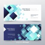 🎉 ¡Domina el arte del diseño con un 📝 banner en Word! Descubre técnicas y plantillas infalibles
 🎨🚀 Descubre las claves para destacar con tu banner Behance y conquista el mundo del diseño
 🎨🎯 ¡El Mejor Diseño Gráfico para tu Banner! Descubre las claves más efectivas aquí 🖥️👩🎨
 🎨 Cómo hacer un banner en Photoshop: Guía completa paso a paso 🖌️
 🎨💻 Cómo hacer un banner en Word: ¡Guía paso a paso para crear diseños impactantes!
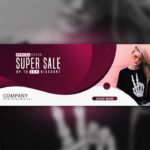 🎨✨ Tutorial Photoshop Banner: Crea diseños llamativos y profesionales paso a paso
 🎨 Cómo hacer un banner en PowerPoint: ¡Deja volar tu creatividad!
 ✨ Crea tu banner gratis: Descubre las mejores herramientas y consejos para diseñar tu propio banner 🎨